When rumors of a Samsung made Verizon Nexus phone started floating around at the end of last year I followed them with great interest. I had read all the fantastic reviews the Galaxy S II had received and when Verizon passed on it the only logical reason was because a Samsung made Google flagship was on the way (or because Verizon felt like screwing their loyal customers yet again, but I digress). I was positive the Galaxy Nexus would be my next phone.
When the phone was announced it checked off the flagship phone feature boxes one by one. The Galaxy Nexus had an OMAP 4460 dual-core processor, an overclocked PowerVR SGX540 GPU, 1GB of ram and a 4.65" Super Amoled 720p screen. Flagship specs by any definition, and yet I couldn't help but be disappointed.
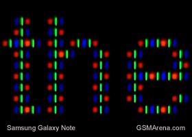
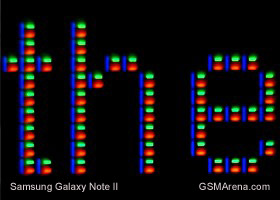
Why? Because of the 720p Super AMOLED screen. The 720p resolution was great, but the lack of a PLUS at the end of the Super AMOLED meant the screen had the dreaded pentile matrix sub-pixel arrangement. What is pentile matrix you might ask? On a conventional screen each individual pixel is made up of a red, green, and blue sub-pixel. On a pentile matrix screen each pixel only has two subpixels. The subpixels generally are in a red, green, blue, green arrangement spread across two pixels. Here is an illustration of the two arrangements:
What this means is that if you want to display white text on a traditional RGB screen it only take one pixel to do it. Alternatively if white text needs to be displayed on a pentile matrix screen, it requires 1 and 2/3 pixels. Here is an example of what this looks like:
(Photos courtesy of GSMArena.com)
Why does this matter? Put simply the image quality is inferior on a pentile matrix screen as a result of subpixel sharing. Text looks less sharp, images have a strange greenish tint to them, and viewing angles are reduced. It also makes screens look dimmer and whites look grey. Personally I would describe the effect as looking at something slightly out of focus. Here is an example of the greenish tint a pentile matrix screen produces (the Galaxy Note is the only pentile matrix screen in the shot):
(Photo courtesy of phonearena.com)
So, the Galaxy Nexus was released and I passed on it. Pentile matrix screens bother my eyes and since I spend the majority of the time on my phone using the screen, it was an easy decision. As 2012 progressed we saw the release of a new generation of flagship phones starting with the HTC One X. The One X has a Super LCD-2 720p RGB screen. To my eyes it is one of the best looking, if not the best looking, screens on the market. It would probably have been my next phone if not for Verizon passing on it.
The next Android flagship phone to be released was the Samsung Galaxy S III. The rumor mill pointed to a 720p Super AMOLED Plus RGB screen. Once again I was sure this would be my next phone. Announcement time came and again disappointment. The Galaxy S III also had a pentile matrix Super AMOLED screen. I passed on it.
No flagship phone on any platform should have a pentile matrix screen. It's simply not as good. No iPhone has ever had a pentile screen. The Windows phone flagships Lumia 900 and 920 both have excellent RGB LCD screens. In fact, the only two companies still producing pentile matrix flagship phones are Motorola and Samsung. Samsung explained they used pentile matrix screens for technical reasons. They said that blue subpixels in Super Amoled screens burn out faster than the red and green subpixels. Of course, this didn't stop them from using an excellent true RGB Super AMOLED Plus screen on the Galaxy S II. The excuse thus rings hollow. Motorola has offered no such explanation, so one can only assume it's a cost saving measure.
Some will argue I'm being overly picky. Some will argue that pentile matrix screens, especially high resolution ones, look fine. They're right. They do look fine and many users probably would be satisfied with the quality. But a flagship phone should look better than fine. If you put a pentile matrix screen up against a true RGB screen the difference is absolutely noticeable during typical use. This is unacceptable.
About a month ago Samsung announced the Galaxy Note 2, their next flagship phone. I barely paid attention because they announced the screen would be yet another Super AMOLED (not Plus) screen. Everyone assumed this meant pentile. I was thrilled to find out that this was not the case. Although the arrangement of the subpixels on the Note 2 is atypical, it is a true RGB screen.
Samsung has finally relegated pentile screens to the past where they belong. Hopefully Motorola follows suit. I am happily buying a Note 2 the day it's released. The flagship phone from Samsung finally has the screen it and every other flagship deserves - a true RGB matrix.


As a Galaxy Nexus owner, I can say that while I'm not bothered by the Pentile display (it is 720p after all) I'd dearly love to see Samsung move towards even better quality screen tech. Especially their Super AMOLED panels, since I'm not a huge fan of LCD (personallly).
ReplyDelete